cristales de luz colombia
cristales de luz
Branding & Design Toolkit

Irrigation Coroneo
Client
Marca
Servicios
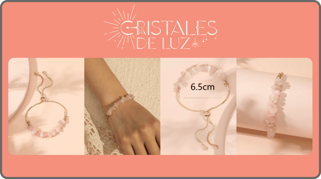
Illuminating the World with Quartz Elegance: Cristales de Luz emerges as a beacon in the realm of quartz accessories, blending the mystical allure of natural crystals with contemporary design. Our branding journey with Cristales de Luz has been about capturing the serene beauty and unique energy that each piece of quartz embodies.

Cristales de Luz Colombia
Jewelry & Accessories
Golden Harmony in Design: The essence of Cristales de Luz is captured in its golden-based branding, reflecting the purity, warmth, and transformative power of quartz. The brand’s identity resonates with those who seek not just an accessory, but a piece of Earth’s magic. From the logo to the packaging, every detail is infused with the elegance of gold, mirroring the timeless beauty and sophistication of the crystals themselves.
CRISTALES DE LUZ
TEMPLATES
Designed to Markdebrand
Made for designers & creatives
Brand Guidelines
CRISTALES DE LUZ
Brand Guidelines
cristalesdeluz.com
1.0
Logo
2.0
Typography
3.0
Colour Palette
4.0
Imagery
5.0
Application
Contents
CRISTALES DE LUZ
1.0 / LOGO
Brand Guidelines
cristalesdeluz.com
Section 1.0 Logo Clear Space
2020 V1.0 / Page 02
Logo Clear Space
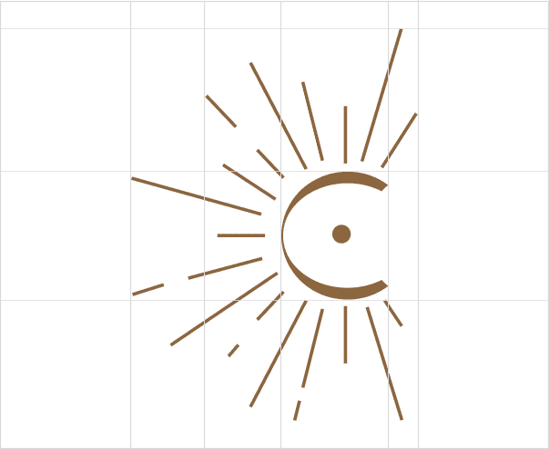
Clear Space Guidelines for Logos:
Clear space, or the free space surrounding a logo, is crucial for maximizing its visibility and impact. This space ensures that the logo is always separated from other visual elements, such as text, images, or even the edge of the material on which it appears.
Guidelines for Clear Space:
- Minimum Space: The minimum space around the logo should be at least equal to the height of the letter “L” in the “Cristales de Luz” logo.
- General Rule: On any graphic or digital material, ensure that there are no invasive visual elements within the defined “Clear Space”.
- Exceptions: In exceptional circumstances, such as on social media where space is limited, the clear space can be minimized, but it should never be completely eliminated.
- Baseline and Maximum Height: Keep the logo aligned with the other visual elements in the design, always respecting the recommended clear space.
DM Serif Display

CRISTALES DE LUZ
1.0 / LOGO
Brand Guidelines
cristalesdeluz.com
Section 1.0 Logo Clear Space
2020 V1.0 / Page 02
Brand Stamp Clear Space
Clear Space Guidelines for Logos:
Clear space, or the free space surrounding a logo, is crucial for maximizing its visibility and impact. This space ensures that the logo is always separated from other visual elements, such as text, images, or even the edge of the material on which it appears.
Guidelines for Clear Space:
- Minimum Space: The minimum space around the logo should be at least equal to the height of the letter “L” in the “Cristales de Luz” logo.
- General Rule: On any graphic or digital material, ensure that there are no invasive visual elements within the defined “Clear Space”.
- Exceptions: In exceptional circumstances, such as on social media where space is limited, the clear space can be minimized, but it should never be completely eliminated.
- Baseline and Maximum Height: Keep the logo aligned with the other visual elements in the design, always respecting the recommended clear space.
DM Serif Display
CIRSTALES DE LUZ
2.0 / TYPOGRAPHY
Brand Guidelines
cristalesdeluz.com
Section 2.0 DM Serif Display
2020 V1.0 / Page 04
Primary Typeface
Primary Typography Guidelines for Cristales de Luz: DM Serif Display
DM Serif Display has been selected as the primary typography for Cristales de Luz. This font is used to establish the tone and personality of the brand in all communications and visual applications.
Guidelines for Using DM Serif Display:
- Application: Use DM Serif Display for titles, headings, and any text that requires strong visual impact.
- Weight and Style: The font comes in different weights. Use the “Regular” weight for a more classic look and “Bold” for highlighting information.
- Size: To ensure readability, the minimum recommended size for text on screen is 18 points, and for print, 12 points.
- Spacing: Maintain consistent letter and line spacing to enhance readability and aesthetics.
- Color: The typography should match the brand’s color palette to maintain a coherent presentation.
Bai Jamjuree
Á À Â Ä Ã ABCDEFGHIJKL
MNOPQRSTUVWXYZ
á à â ä ã abcdefghijklm
nopqrstuvwxyz
1234567890
!@#$%^&()*+{ }
ÆÇÈØxæç
Aa
CRISTALES DE LUZ
3.0 / COLOUR PALETTE
Brand Guidelines
cristalesdeluz.com
Section 3.0 Brand Colours
2020 V1.0 / Page 05
Brand Colours
Primary Brand Color: Coral (F5907C)
Coral (F5907C) has been chosen as the primary color for the Cristales de Luz brand. This shade not only captures attention but also evokes feelings of warmth, energy, and well-being, aligning with the company’s mission and vision.
Guidelines for Using the Primary Color:
- Main Application: This color should be the most prominent in all brand applications, from the website and digital marketing to printed materials.
- Highlighted Elements: Use this color for titles, calls to action, buttons, and other elements that require immediate attention.
- Contrast: Ensure that the primary color contrasts well with other secondary and background colors to ensure readability and visual appeal.
- Consistency: Maintain this color consistently across all platforms and applications to reinforce the brand identity.
HEX
FAC8C1
RGB
250 200 193
HSL
7 85 87
HSB
7 23 98
HEX
F5907C
RGB
245 144 124
HSL
10 86 72
HSB
10 49 96
HEX
BADBD0
RGB
186 219 208
HSL
160 31 79
HSB
160 15 86
HEX
006E81
RGB
0 110 129
HSL
189 100 25
HSB
189 100 51
HEX
D9D9D9
RGB
217 217 217
HSL
0 0 85
HSB
0 0 85
CIRSTALES DE LUZ
3.0 / COLOUR PALETTE
Brand Guidelines
cristalesdeluz.com
Section 3.1 Brand Colours
2020 V1.0 / Page 06
Hero colour
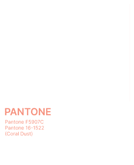
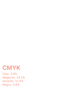
Hero Color: Coral (F5907C)
The “Hero Color” is the primary tone leading the brand’s color palette, used in the most significant applications to capture the essence of the brand. For Cristales de Luz, this color is Coral (F5907C).
Guidelines for Using the Hero Color:
- Strategic Application: Use the hero color in key elements such as logos, headers, calls to action, and any focal points that require special attention.
- Visibility and Contrast: Ensure that the hero color stands out clearly against background elements to maximize its impact.
- Consistency: Maintain consistent use of this color across all platforms and media to reinforce brand identity.
- Avoid Saturation: Although it is the primary color, overuse could be counterproductive. Maintain a balance with other secondary and background colors.

CRISTALES DE LUZ
3.0 / COLOUR PALETTE
Brand Guidelines
cristalesdeluz.com
Section 3.2 Brand Colours
2020 V1.0 / Page 07
Colour Tints
Color Palette: Harmony and Elegance in Quartz
At the heart of our quartz accessories brand lies a color palette that reflects the natural beauty and vibrant energy of our products. Each shade has been carefully chosen to represent the essence of elegance, balance, and serenity.
- Quartz Pink: A soft and welcoming hue that evokes feelings of love and tenderness. It represents delicacy and calm, perfect for highlighting the femininity and gentleness of our accessories.
- Emerald Green: Inspired by the depth and richness of forests, this green symbolizes growth and renewal. It brings a touch of freshness and vitality, connecting our customers with nature.
- Sapphire Blue: This deep and captivating tone symbolizes wisdom and confidence. It is elegant and sophisticated, ideal for accessories that seek to convey a message of authority and serenity.
- Slate Grey: A neutral and versatile color, offering balance and stability. This grey is the perfect base to combine with any other color, reflecting the strength and durability of our quartz.

CRISTALES DE LUZ
4.0 / IMAGERY
Brand Guidelines
cristalesdeluz.com
Section 4.0 Image Direction
2020 V1.0 / Page 08
Image Direction
Image Direction: Capturing the Essence of Quartz
The image direction of our brand is a visual celebration of the unique beauty and power of quartz. Our goal is to capture not just the elegance of our accessories, but also the energy and spirituality each piece embodies. Our image direction focuses on three key aspects:
- Naturalness and Authenticity: Our photography aims to convey the purity and authenticity of the materials. We prioritize shots that highlight the texture and natural shine of the quartz, set in environments that evoke their connection to the earth and nature.
- Elegance and Minimalism: Each image should reflect sophistication and simplicity. We use neutral backgrounds and clean compositions to ensure the focus is always on the accessory, highlighting its design and quality without distractions.
- Light and Shadow: Lighting plays a crucial role in revealing the facets and hues of each quartz. We experiment with contrasts of light and shadow to create images that showcase the depth and richness of colors, while also evoking emotions and telling a story.
CRISTALES DE LUZ
5.0 / APPLICATION
Brand Guidelines
cristalesdeluz.com
Section 5.0 Digital Application
2020 V1.0 / Page 08
Digital Application
Digital Application:
Crafting a Visual Identity on Social Media
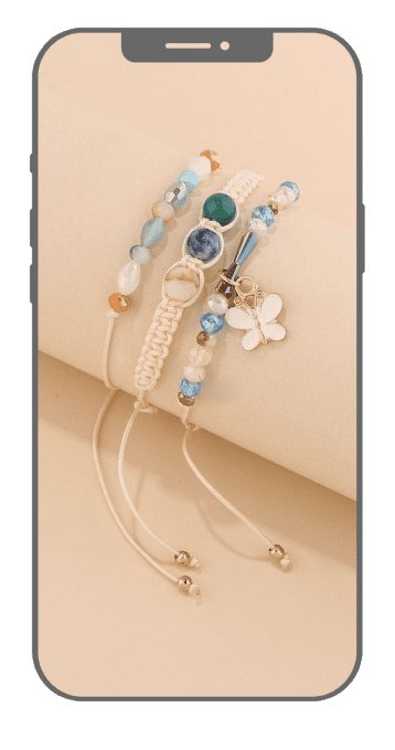
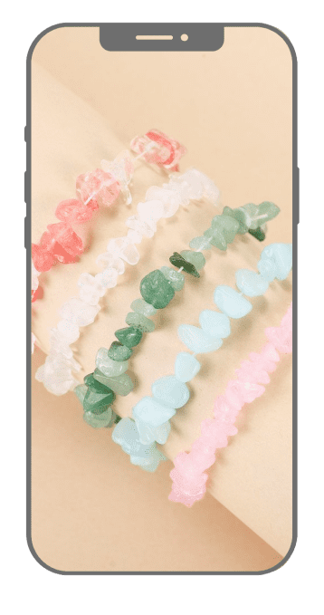
Our brand’s digital presence is tailored to showcase the elegance of our quartz accessories through compelling visual storytelling on social media. Our strategy emphasizes these key elements:
- Product Photography: Each accessory is captured in a way that highlights the unique qualities of the quartz. Natural lighting is used to emphasize its shine and texture, against backgrounds that enhance the quartz colors, ensuring the product remains the focal point.
- Color Palette: Our posts consistently feature our signature palette of pinks, greens, blues, and greys. This not only creates a recognizable visual identity but also evokes the healing and aesthetic qualities of quartz.
- Composition and Design: We strive for balance and harmony in every post. Symmetry, negative space, and thoughtful alignment of visual elements ensure our images are pleasing and engaging.
- Visual Narrative: Each image tells a part of our brand story. Whether showcasing a product or capturing lifestyle moments, we aim to forge an emotional connection with our audience. The captions complement the images, adding depth to our visual storytelling.

CRISTALES DE LUZ
5.0 / TYPOGRAPHY
Brand Guidelines
cristalesdeluz.com
Section 5.1 Digital Application
2020 V1.0 / Page 09
Digital Application
Our brand transcends into the digital realm through a website that serves not only as a sales platform but also as an extension of our brand identity. Every aspect of the website is meticulously designed to reflect the values and aesthetics of our quartz accessories brand:
- Intuitive Design and Navigation: The website offers a smooth and engaging user experience. Its intuitive design facilitates easy navigation, allowing visitors to explore our collection of accessories effortlessly and enjoyably.
- Color Palette and Typography: The website’s color palette echoes our visual identity, using tones that resonate with our quartz collections. The typography is chosen to complement and strengthen our brand image, ensuring readability and stylistic consistency.
- Images and Product Visualization: High-quality, brand-cohesive images are featured on the website. Each product is showcased in detail, highlighting the unique characteristics of the quartz and the craftsmanship of each piece.
- Content and Brand Narrative: We incorporate content that tells the story of our brand and products. From the history behind each collection to the manufacturing processes, we aim to create a deeper connection with our customers.
